
Having a mobile-friendly website is no longer optional—it’s essential.
In fact, mobile web usage now makes up over half of all global web traffic.
For Local businesses, this trend has a direct impact on your online visibility, as search engines like Google are placing increasing emphasis on mobile optimisation when ranking websites.
A mobile-friendly website isn’t just a user experience perk—it’s an SEO essential. If you’re aiming to attract more visitors, rank higher in search results, and keep users on your site, mobile optimisation is key.
Let’s take a look at why a mobile-friendly design matters so much and how our Blackpool SEO Services can help you achieve your online business goals.

1. The Rise of Mobile Usage and Google’s Mobile-First Indexing
The way people access the internet has fundamentally changed.
With smartphones being widely accessible, users now turn to their mobile devices for everything from browsing the news to making purchases.
This shift has pushed search engines, especially Google, to change how they rank websites in order to accommodate mobile browsing preferences.
In 2018, Google officially rolled out mobile-first indexing. In simple terms, this means Google primarily uses the mobile version of a site’s content for ranking and indexing rather than the desktop version.
For websites that aren’t optimised for mobile, this can mean lower rankings and, in turn, fewer visitors. A mobile-friendly design ensures that your site is ready to meet Google’s expectations and capture as much search engine traffic as possible.
2. Enhancing User Experience
User experience (UX) plays a huge role in how long visitors stay on your site and whether they return.
A mobile-friendly design ensures that your content displays correctly on smaller screens, is easy to read, and has a clear navigation structure.
When users have a positive experience, they’re more likely to stay on your site, explore your content, and potentially make a purchase.
From an SEO perspective, time spent on-site and bounce rate are important metrics.
If users find your site difficult to use on their mobile devices, they’re likely to leave quickly, which signals to search engines that your site isn’t meeting user expectations.
A mobile-friendly design helps reduce bounce rates and encourages longer sessions, both of which positively impact your SEO.
3. Faster Page Loading Times
A key benefit of mobile optimisation is improved page load times. Google has made it clear that page speed is an important ranking factor, and this holds even more weight on mobile devices.
Mobile users typically expect faster load times—after all, they’re often on the go and looking for quick answers. A slow website not only frustrates users but also leads to higher bounce rates and lower conversions.
By designing a mobile-friendly website, you’re more likely to achieve faster load times. Techniques like compressing images, using responsive design, and prioritising content loading can drastically improve your site’s performance on mobile devices, which can directly enhance your SEO.
4. Gaining an Edge in Local Search

For businesses serving local customers, having a mobile-friendly site is essential.
Mobile users frequently search for local businesses on the go, such as “coffee shops near me” or “plumber in [town name].”
Local searches often have a high conversion rate, as users are actively looking to make a purchase or find services nearby.
Google’s local search results, including features like Google Maps and Google My Business, favour mobile-friendly sites.
For example, if a user searches for a service on their mobile, a mobile-optimised website is more likely to appear at the top of search results. This increases the chances of capturing local customers at the moment they’re most interested.
5. Increasing Social Media Traffic
A significant portion of traffic to websites today comes from social media.
Most social media activity occurs on mobile devices, meaning users are often directed to your website from their phone or tablet.
If your site isn’t mobile-friendly, visitors from social media are likely to experience slow load times and poor usability, making them less likely to stay or engage.
When social media visitors have a seamless mobile experience on your site, they’re more likely to share your content, follow your brand, and make return visits.
This not only increases your website traffic but also boosts brand engagement, all of which contribute positively to your SEO.
6. Staying Competitive in Your Industry
Having a mobile-friendly website is no longer a luxury—it’s a necessity.
Most of your competitors are already mobile-optimised, and failing to keep up puts you at a disadvantage.
Users who have a poor mobile experience on your site are likely to switch to a competitor’s site that is mobile-friendly.
In the fiercely competitive online market, providing a seamless mobile experience helps you retain customers, improve your search engine rankings, and stay relevant.
7. The Role of Responsive Web Design
Responsive web design is one of the most popular ways to make a website mobile-friendly.
This design approach automatically adjusts the layout and content to fit the user’s screen size, providing a consistent experience across all devices.
With responsive design, there’s no need to create a separate mobile version of your site, which makes maintenance easier and ensures that your content is consistent.
Search engines favour responsive websites as they offer a streamlined experience without duplicate content, which can confuse search engines and harm SEO.
Implementing responsive design not only makes your site user-friendly but also provides the added benefit of meeting Google’s mobile-friendly criteria.
8. Best Practices for Mobile-Friendly Web Design For SEO
To ensure your site is mobile-friendly and optimised for SEO, here are some key best practices to follow:
Use a Responsive Design: As mentioned, responsive design is crucial for seamless functionality across devices. It’s also one of the most effective ways to satisfy Google’s mobile-first indexing requirements.
Optimise Images: Large images slow down page load times on mobile devices. Compress images and use formats like JPEG or WebP to reduce file sizes without sacrificing quality.
Prioritise Readable Text: On mobile devices, small text can be hard to read. Ensure font sizes are large enough for mobile users and that text is spaced appropriately.
Streamline Navigation: Complex menus don’t translate well on mobile. Use clear, simple navigation that makes it easy for users to find what they’re looking for without endless scrolling or clicking.
Implement Accelerated Mobile Pages (AMP): AMP is a Google-backed project that creates fast-loading versions of web pages for mobile users. Implementing AMP can help your pages load instantly, which positively impacts both user experience and SEO.
Test Regularly: Using a Mobile-Friendly Test tool allows you to check how easily a visitor can use your page on a mobile device. Regular testing helps you identify areas for improvement and keep your mobile optimisation up to date.
FAQs
Q: Does mobile-friendliness impact my Google ranking? A: Yes, mobile-friendliness is a significant ranking factor for Google, particularly since the launch of mobile-first indexing.
Q: Is it enough to have a mobile version of my website? A: Not necessarily. A responsive design is often the best approach as it adjusts automatically to all devices, ensuring a consistent experience without duplicate content.
Q: How fast should my mobile website load? A: Ideally, your mobile site should load in 1-2 seconds. Longer load times often lead to higher bounce rates.
Q: Can I test my site’s mobile-friendliness? A: Absolutely. Google offers a Mobile-Friendly Test tool that assesses your site’s mobile usability and provides insights on improvements.
Q: Will a mobile-friendly design increase traffic to my site? A: Yes, by improving user experience and search rankings, a mobile-friendly design can lead to increased traffic and lower bounce rates.
Q: How does mobile-friendliness affect local SEO? A: A mobile-friendly design helps improve your visibility in local searches, which is especially important for businesses that serve specific geographic areas.
Q: Do mobile users prefer different content? A: Mobile users often look for concise, easy-to-read content that provides quick answers. Consider using shorter paragraphs, bullet points, and clear calls to action.
Q: What’s the cost of making my website mobile-friendly? A: The cost varies depending on the scope of work and your site’s current setup. However, investing in mobile optimisation can bring long-term benefits to both your traffic and search rankings.
How Can DTC Help Your Business?
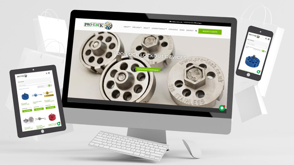
At Digital Transformation Consultancy, we craft stunning, mobile-friendly websites that capture attention and provide seamless experiences on every device.
Our highly experienced team understands that in today’s mobile-first world, a website needs to be visually appealing and fully responsive, ensuring that your brand looks its best on smartphones, tablets, and desktops alike.
With a strong focus on user experience, we build sites that are fast-loading, easy to navigate, and optimized for search engines.
Choosing DTC means investing in a website that not only reflects your brand’s unique personality but also meets modern usability standards, helping you connect effectively with your audience everywhere.
Contact us today to find out all about our affordable web design services.
In Conclusion
For UK businesses aiming to succeed in today’s mobile-first world, a mobile-friendly website is essential. Not only does it improve user experience, but it also boosts your search engine rankings, drives traffic, and helps retain visitors.
Whether you’re a small business in Blackpool or a larger enterprise, investing in mobile-friendly design is an investment in the future of your online presence.
With the right approach to mobile optimisation, you’ll see benefits in both SEO and customer satisfaction.
So, why wait? Start prioritising mobile-friendliness today and watch as your website climbs the search rankings and engages more users than ever before.